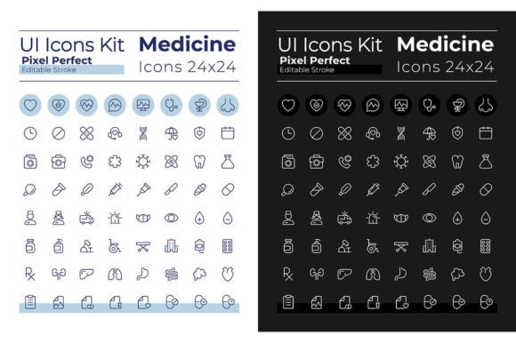
Medical UI Icons: Pixel Perfect SVG Set for Dark & Light Modes
Designing a healthcare app, medical website, or wellness platform comes with a unique visual challenge: how do you communicate complex, sensitive information clearly while maintaining a professional and trustworthy aesthetic? The answer often lies in the details—specifically, the icons that guide users through interfaces, highlight features, and simplify navigation. A cohesive, high-quality icon set isn't just decorative; it's a fundamental component of user experience and brand perception. For designers and developers tackling these projects, finding assets that are both versatile and meticulously crafted is a game-changer.
Why Pixel Perfection Matters in Medical Interfaces
In healthcare design, clarity isn't a luxury—it's a necessity. Users might be patients seeking quick information, medical professionals accessing critical tools, or administrators managing sensitive data. Every visual element must be instantly recognizable and free of ambiguity. This is where a pixel-perfect approach to icon design becomes invaluable. Each icon in this set is crafted on a precise grid, ensuring that at any size, lines are crisp, details are sharp, and shapes are unambiguous. Whether displayed as a tiny status indicator on a mobile dashboard or as a prominent feature icon on a desktop portal, the visual integrity remains intact. This meticulous construction eliminates the blurry or uneven edges that can occur with poorly optimized graphics, directly enhancing readability and reducing cognitive load for the user.
Beyond pure clarity, the aesthetic tone of your interface significantly impacts user trust. A system designed for clinical use might demand a different feel than a consumer-facing wellness app. The inclusion of both dark and light mode linear icon sets directly addresses this need for thematic flexibility. The dark mode icons, with their lighter strokes on a dark background, are ideal for reducing eye strain in low-light environments, which is perfect for patient portals used in the evening or by night-shift staff. Conversely, the light mode icons offer a clean, airy feel suited for traditional, brightly-lit interfaces or print materials. This duality allows designers to maintain complete visual consistency across every touchpoint of a product, regardless of the chosen theme, reinforcing a polished and professional brand identity from the first interaction.
From Digital Interfaces to Tangible Brand Assets
The true value of a comprehensive design asset like this extends far beyond the initial screen it was designed for. The SVG, EPS, and AI file formats included mean these icons are not confined to a single digital project. They become foundational elements of a broader visual language that can unify an entire brand ecosystem.
Consider the logo design process. A distinctive icon from the set can serve as the cornerstone of a medical practice's logomark, ensuring instant recognition and a clear connection to the healthcare field. This same icon, with its editable stroke, can be adapted for use on packaging for pharmaceutical products or wellness goods, creating a seamless link between the digital experience and the physical product a customer holds. For social media graphics and marketing assets, these icons provide a ready-made library of professional imagery. They can be used to create cohesive Instagram stories highlighting health tips, design informative infographics for a blog, or add visual cues to email newsletters, saving hours of design time while elevating the overall production value.
Print materials benefit equally. A clinic's brochure, appointment cards, or informational posters can integrate these icons to break up text, guide the reader's eye, and present information in a more digestible format. For entrepreneurs developing digital products like health-tracking apps or telehealth platforms, the icons are essential UI elements for buttons, navigation menus, and feature highlights. They ensure the interface feels intuitive and professionally designed, which is critical for user adoption and retention. Even for something as personal as an invitation to a wellness workshop or a charity fundraiser, incorporating a relevant medical icon adds a layer of thematic sophistication and clarity.
Practical Integration and Font Pairing
Working with a versatile icon set is straightforward, but a few practical considerations can maximize its impact. The editable stroke feature is particularly powerful. It allows you to adjust the line weight to match the visual weight of your typography or other design elements. For a bold, impactful header using a typeface like Montserrat Bold, you might opt for a slightly heavier icon stroke to maintain visual balance. For body text or secondary information paired with Montserrat Light, a finer stroke can keep the design delicate and uncluttered.
This brings us to typography. The inclusion of the popular and highly legible Montserrat font family is a thoughtful addition. Its clean, geometric sans-serif forms are a natural companion to linear icon styles. When pairing, consider hierarchy. Use Montserrat Bold for primary headings or calls-to-action and pair it with icons of similar visual prominence. Use Montserrat Light for descriptive text or secondary labels, accompanied by icons that support rather than dominate. Always test pairings in context—view them on a mockup of your website, app screen, or printed page to assess the overall harmony and readability.
Before finalizing your designs, review the full library of 64 icons per mode. This ensures you're not just picking icons in isolation but are planning a consistent system. Map out which icons will represent key features or sections in your project. This planning prevents visual inconsistencies and ensures that every icon use feels intentional and part of a cohesive family. Finally, while the assets are provided for commercial use, it's always prudent to double-check the specific license terms for any project, especially for large-scale distribution or merchandise, to ensure full compliance.
Ultimately, investing in a high-quality, thoughtfully designed icon set is an investment in your project's credibility and user experience. It streamlines the design process, elevates the final product, and provides a flexible toolkit that can grow with your brand across both digital and physical realms. In the detailed world of medical and wellness design, where trust and clarity are paramount, having pixel-perfect, theme-adaptable icons at your fingertips is not just convenient—it's essential.